A pocket square and a tie serve two distinct visual functions. The tie structures the torso by drawing a vertical line from the collar to the waist. The pocket square, on the other hand, creates an asymmetrical focal point on the chest. Matching these two accessories does not mean making them identical, but rather organizing a dialogue between them so that the outfit gains coherence without appearing rigid.
Identical pocket square and tie: why this combination detracts from the suit
The most common reflex is to buy a pocket square-tie set in the same fabric, with the same colors and pattern. This choice results in a flat outcome. Two identical pieces eliminate all visual contrast and suggest that the outfit was assembled without thought.
The problem is technical. When the eye perceives two identical surfaces a few centimeters apart, it does not focus on either. The effect of mutual enhancement disappears.
The goal is to create a perceptible link between the pocket square and the tie while maintaining a difference. Knowing how to match a tie and a pocket square is based on this principle of kinship without duplication.
Color wheel and color coordination between tie and pocket square
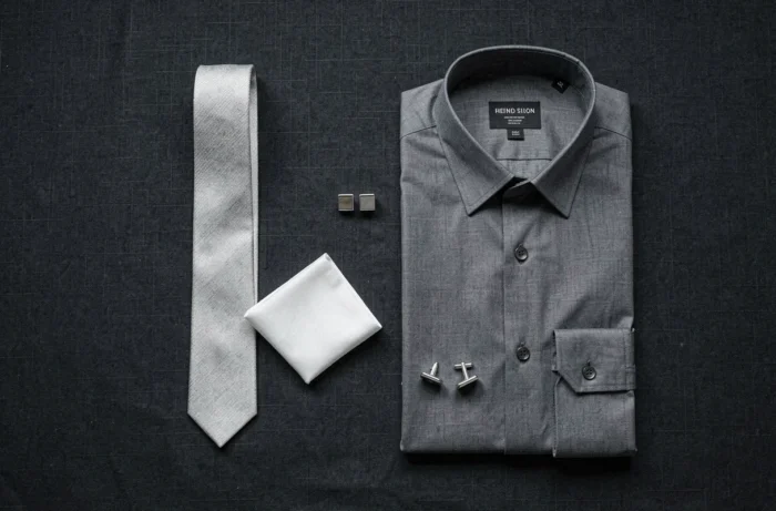
The color wheel is the basic tool for choosing colors. It classifies hues based on their position on the light spectrum and allows for the identification of three types of useful combinations.
- Complementary colors (opposite on the wheel) create a marked contrast. A navy tie with a pocket square in a rust orange tone produces a strong opposition, suitable for wedding or ceremonial outfits.
- Analogous colors (adjacent on the wheel) give a harmonious and discreet effect. A burgundy tie with a plum or brick pocket square works well for a professional context.
- Monochrome (variations of the same hue) remains the safest combination. A midnight blue tie paired with a sky blue pocket square maintains a chromatic unity while preserving the difference in value.
The pocket square can take a secondary color present in the tie. If the tie features burgundy micro-patterns on a blue background, a solid burgundy pocket square is enough to create a link. Extracting a secondary color from the tie for the pocket square is the most reliable method to avoid missteps.
Combining patterns without overloading the outfit
Combining two patterned accessories works, provided that a scale difference is respected. A tie with fine stripes can coexist with a pocket square with large polka dots because the two patterns do not compete visually.
On the other hand, two patterns of similar size (small dots on the tie, small checks on the pocket square) produce a cluttered effect. The eye does not know where to settle.
The rule of one dominant pattern
The most readable combination is to reserve the pattern for only one of the two accessories. Patterned tie with a solid pocket square, or vice versa, works in almost all contexts. For a wedding, a tie with paisley micro-patterns and a solid pocket square in a complementary tone is enough to structure the whole.
If both pieces feature a pattern, varying both the scale and the type of design (stripes versus dots, for example) reduces the risk of overload.
Choice of materials: silk, linen, wool and their effects on style
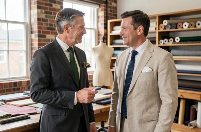
The material alters the perception of an accessory as much as its color. A pocket square in raw linen folded into a simple point projects a relaxed image, even when worn with a dark suit. A shiny silk pocket square, on the contrary, formalizes the outfit.
The contrast of textures between tie and pocket square adds an extra dimension. A matte silk tie paired with a satin silk pocket square creates a subtle yet perceptible difference. A knitted wool tie with a cotton or linen pocket square introduces a more pronounced contrast, suitable for smart casual codes.
Adapting the material to the context
For a business formal context (suit and tie required), silk remains the standard choice for both pieces. In smart casual, mixing textures becomes a lever of elegance: the tie can disappear, and a linen or cotton pocket square is enough to enhance a jacket worn open-collared.
Since the end of the 2010s, several professional dress code guides have noted that the tie is no longer systematically mandatory, even in urban contexts. The pocket square, however, retains its status as a finishing accessory. In an environment where the tie is optional, wearing only the pocket square allows for a visible level of care without rigidity.
Pocket square folding: what style of fold according to the outfit
The folding alters the volume and degree of formality of the pocket square. Three folds cover the majority of situations.
- The straight fold (or presidential fold): a rectangle that extends one centimeter beyond the edge of the pocket. Simple, geometric, suitable for formal outfits and dark suits.
- The single point fold: a centered triangle that adds a bit of relief. Versatile, it is suitable for both a wedding and a professional meeting.
- The “puff” fold: the pocket square is simply crumpled and slipped into the pocket. Casual, it works best with textured materials like linen or cotton.
The choice of fold interacts with the material. A straight fold in linen appears slightly careless because the fabric does not hold a sharp edge. Silk, on the other hand, maintains a geometric fold effortlessly.
The final agreement between tie and pocket square relies on the coherence of intention: formal, casual, or intermediate. Choosing the color, pattern, material, and folding based on the same register produces a readable result. Just one of these four elements out of sync with the other three is enough to unbalance the outfit.